This post came from the Aestiva Solutions quarterly newsletter, the Campfire. To subscribe, click here.
Hello Friends!
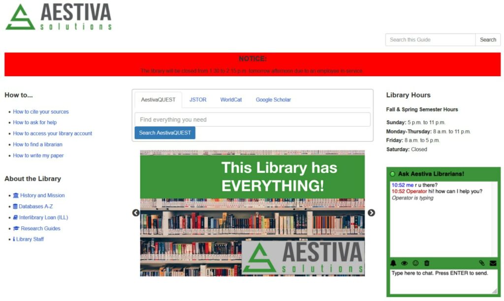
In our last Aestiva Campfire we shared quick wins for your LibGuides, in the form of four quick and simple changes to improve your library web presence. In this issue we would like to share some LibGuides BIG wins. Let’s return to where we left off with our Aestiva Solutions LibGuide. While we have already seen improvements in this guide, there is still plenty of room for more.
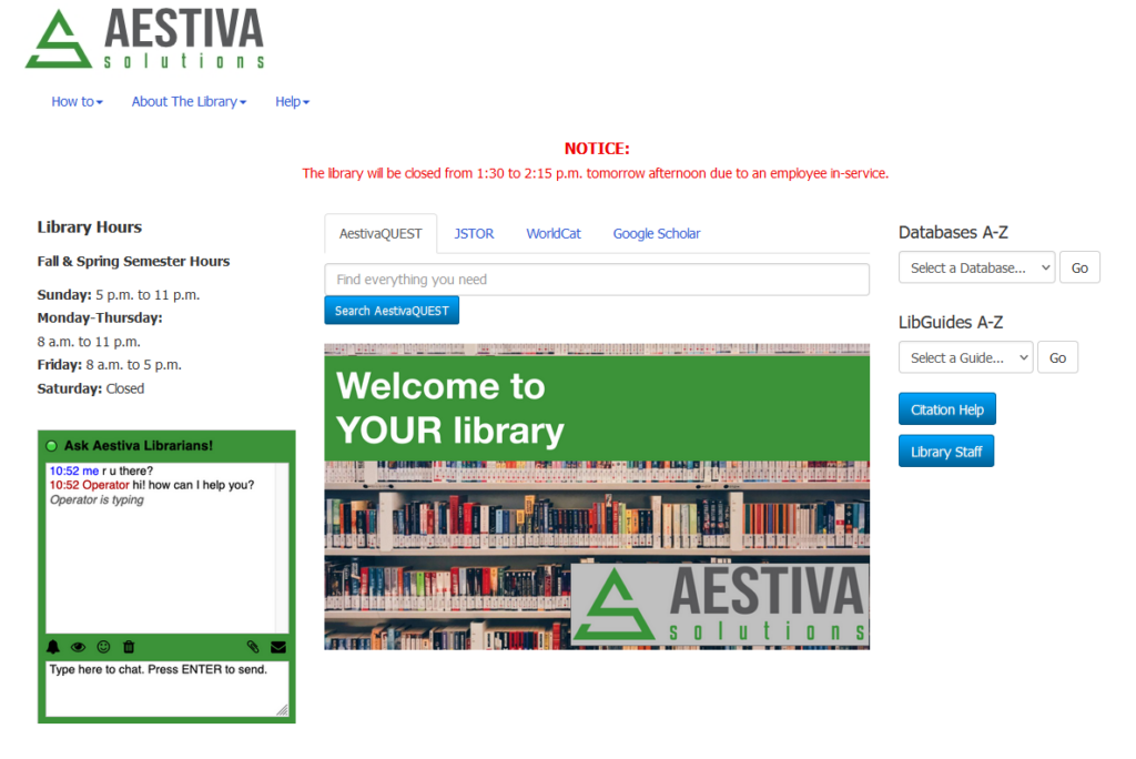
To continue our improvements, we changed four areas and now have this much better guide:
Here are the four areas we focused on:
1. Changing the font. Although LibGuides default font is by no means ugly or unreadable, by changing the font you can better align your LibGuides to your institution’s branding as well as set a particular tone and improve overall page attractiveness and readability. Here’s how to change fonts.
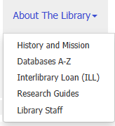
2. Removing long lists of links. Nielsen Norman suggests this rule of thumb: “it’s better to use a listbox or dropdown list when there are 5 or more items from which users can choose.” For our site, we made three new design choices. First, we added a top drop-down menu with a few common categories. (This requires a bit of slightly sophisticated coding. You can read about the basic structure at W3Schools.)
Second, we added two drop down boxes for patrons who are looking for a database or a LibGuide.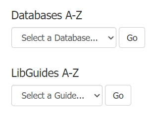
Third, we added two buttons for very commonly used links.

All of these use easily available LibGuides features. Here’s how to create drop-down menus, and here’s how to create buttons.
3. Removing the slide show. Instead of having a rotating slideshow, we decided to have one stand alone image. Why? While slide shows have great potential in highlighting a series of events or services, they can also be misused or overused. Consider the objectives of your library website and needs of your library users in deciding when or when not to include a slide show.
4. Enhancing the alert box. We spent a little bit of time customizing our alert box that appears at the top of our site when needed. Originally, we made the background of the box bright red in order to draw the reader’s eyes to it. However, design choices like this can be overwhelming to users. In our new version, we removed the background color and instead made the font color red. This allows for an eye-catching message without being obnoxious. Remember, less is more!
Want assistance in updating your LibGuides library website? Aestiva Solutions would love to help! Please reach out and let’s start a conversation.
Ruth and Eric